Nearly everyone has had the experience: a color that looked like a calm gray in the store turns lavender on the bedroom wall, or a soft white suddenly reads yellow next to the kitchen cabinets. The paint did not change. The light, the surrounding colors and the size of the surface did.
Choosing interior colors becomes much easier once you know what influences them. This guide covers the main factors and a practical process we use with homeowners in West Springfield, Springfield and nearby towns.
Start with the light
Natural light changes throughout the day and depends on which way a room faces. In the Northern Hemisphere, north-facing rooms get cooler, indirect light that can make colors look grayer and a little flatter. South-facing rooms get warm, strong light for much of the day, which brightens colors and warms them up. East-facing rooms are bright and warm in the morning and cooler later; west-facing rooms are the opposite.
Artificial light matters just as much, especially in winter when you spend evenings under lamps. Bulbs labeled warm white push colors toward yellow and red, while daylight bulbs pull toward blue. It is worth checking which bulbs you use before finalizing a color.

Understand undertones
Most neutrals are not truly neutral. Grays lean blue, green or violet. Whites lean warm or cool. Beiges lean pink, yellow or green. These undertones are hard to see on a small chip but become obvious on four walls, where the color reflects onto itself and intensifies.
A reliable trick is to compare several chips of the same general color side by side, or hold them against a sheet of plain white paper. The undertone that was invisible alone usually becomes clear in comparison.
Work around what is not changing
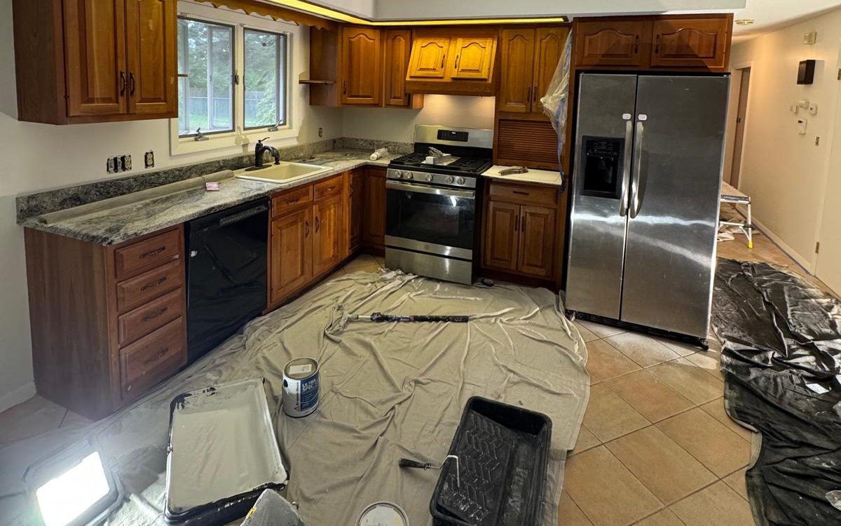
Floors, countertops, cabinets, stone fireplaces, large furniture and even the view out the window all influence how a paint color reads. Rather than choosing a color first and hoping it works, start with the fixed elements and choose paint that complements them.
- Warm wood floors often pair well with warm whites and greiges.
- Cool gray tile or stone usually looks cleaner with cooler whites and grays.
- Busy countertops or wallpaper benefit from a quieter wall color pulled from them.
- Strong furniture colors can be echoed with a muted version on the walls.
This approach also helps the whole home feel connected. Choosing a family of related colors for rooms that can be seen from each other avoids a patchwork effect in open floor plans.
Sample the right way
Small chips are only a starting point. Once you have narrowed it down to two or three candidates, test them at a larger size on the actual walls. Paint a patch at least two feet square, or use large sample boards you can move around the room.

Look at the samples in the morning, mid-afternoon and at night with your usual lamps on. Place them on more than one wall, since the wall beside a window looks very different from the one facing it. Give yourself a couple of days; first impressions often change.
When you have chosen, write down the brand, color name, code and sheen for each room. That record makes future touch-ups much easier, and our article on choosing the right sheen explains why the sheen belongs on the list too.
A few more tips
- Colors look darker and more saturated on large walls than on chips, so many people end up going one step lighter.
- Ceilings do not have to be stark white; a slightly tinted ceiling can make a room feel more finished.
- Accent walls work best on a wall that already draws attention, like behind a bed or a fireplace.
- Dark colors in small rooms can feel cozy and intentional rather than cramped, especially with good lighting.
If you would like a second opinion, our crew is happy to paint sample patches as part of an interior painting estimate so you can see colors on your own walls before deciding.
Thinking about flow between rooms
In older homes with separate rooms and doors between them, each space can have its own personality. In newer or renovated homes with open sightlines, the colors you choose for one room are visible from the next, and they need to work together. A useful approach is to pick one primary neutral for the connected spaces, then use variations of it, lighter, darker or on the same color strip, to give each area its own feel without breaking the flow.
Trim color is another unifying tool. Using one consistent trim white throughout the house ties rooms together even when wall colors vary. If you prefer a colored trim or darker doors, repeating that choice in several rooms makes it look deliberate rather than random.
Finally, remember that color does not stop at walls. Ceilings, doors, built-ins and even stair risers are all opportunities. A tinted ceiling in a dining room, a painted interior door in a deep color, or wallpaper in a powder room can add character without committing an entire room to a bold choice. If pattern appeals to you, our wallpaper installation service is an easy way to try it on a single wall.
Color mistakes that are easy to avoid
The most common mistake is choosing under store lighting and never testing at home. The second is choosing a white in isolation; whites are strongly influenced by everything around them, and the right white for a sunny south-facing kitchen may look dingy in a north-facing hallway. The third is picking all the colors for a house at once from a single small fan deck, which can produce a palette that looks harmonious on paper and disjointed in real rooms.
It also helps to be honest about how you use a room. A deep, moody color in a home office can make video calls look warm and focused, while the same color in a small, dark mudroom may feel heavy. Choosing with the room's purpose in mind usually leads to colors you are happy living with for years.
Frequently asked questions
The larger surface intensifies the color, the light in your room differs from the store, and surrounding colors like floors and furniture shift how you perceive it. Testing large samples in place is the best way to avoid surprises.
Two or three finalists is usually enough. More than that makes comparison harder. Narrow down with chips first, then test the finalists at full size.
It does not have to be, but a related family of colors helps rooms that are visible from each other feel connected. Many homes use one main neutral with a few rooms in stronger colors.
Related services: